
Collection: Beige Rugs
Warm beige and cream rugs.
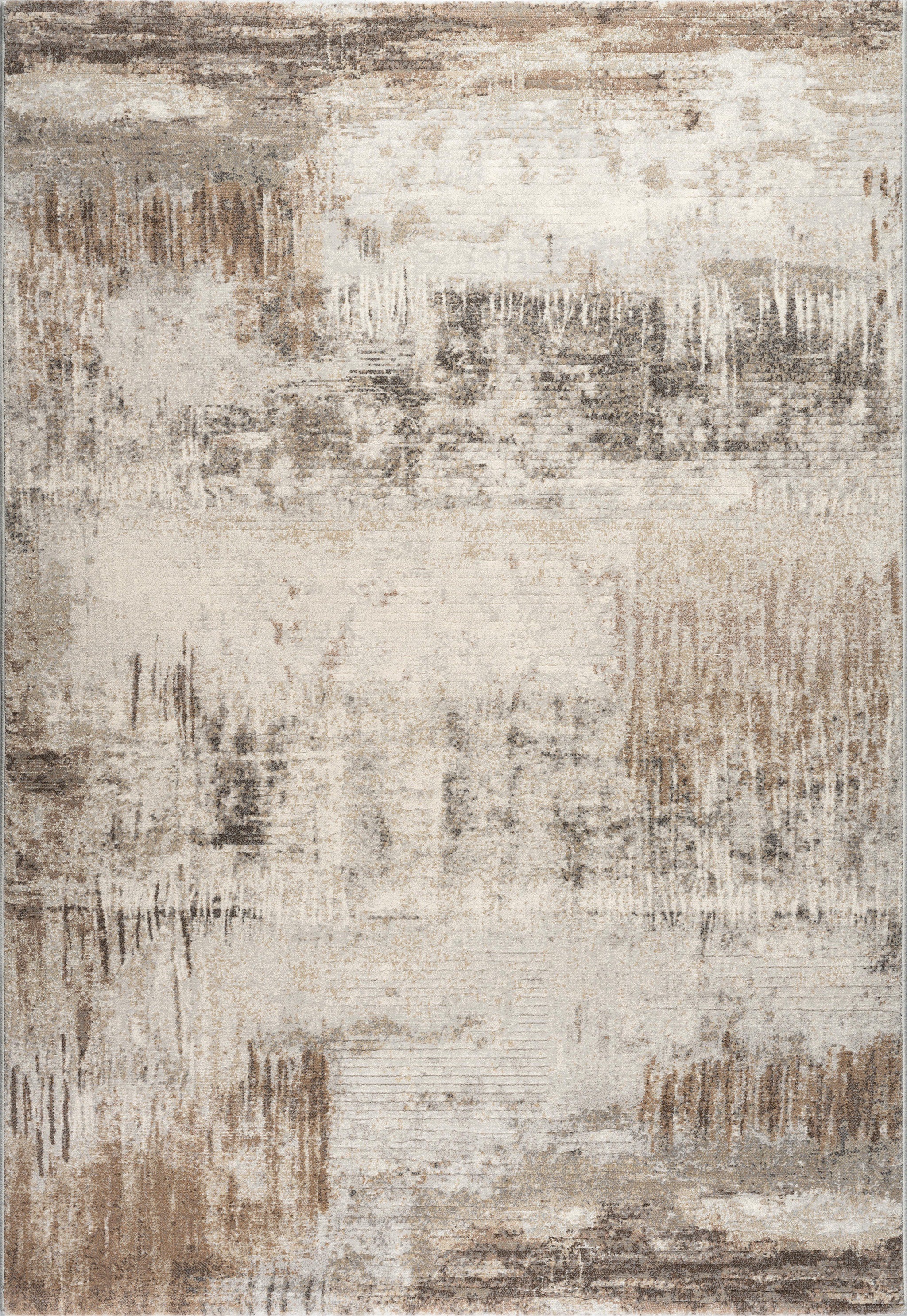
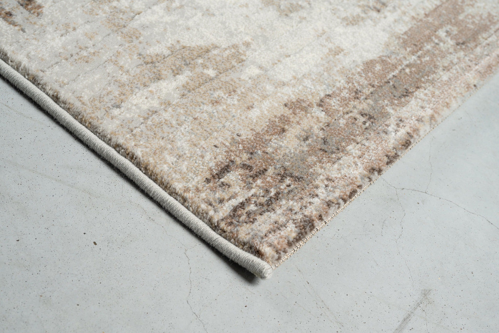


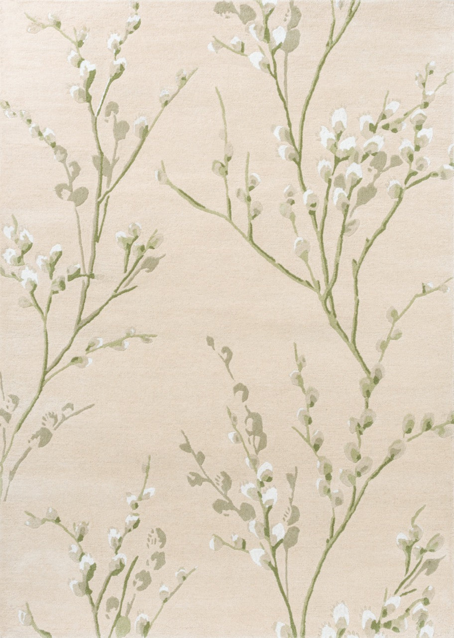
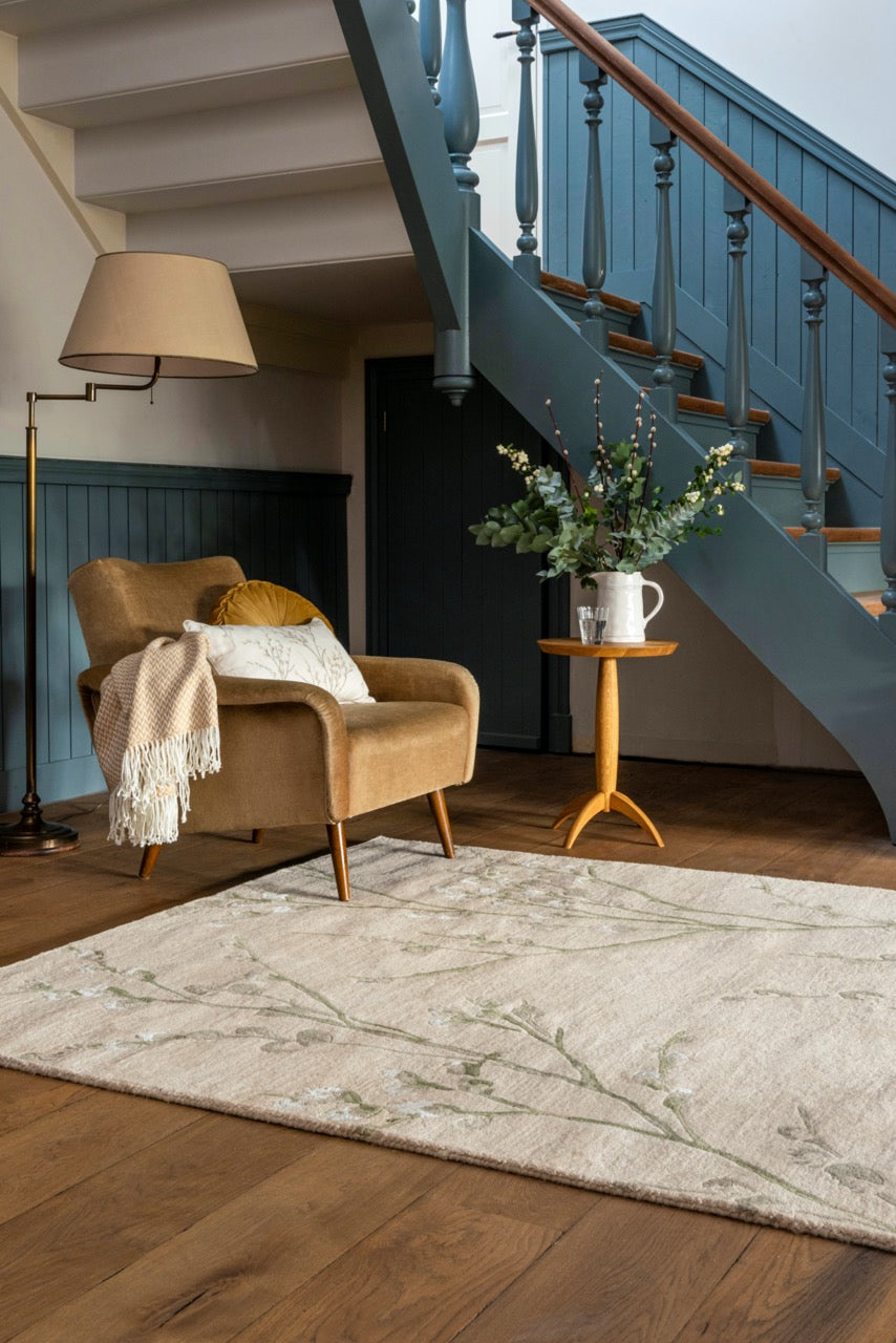

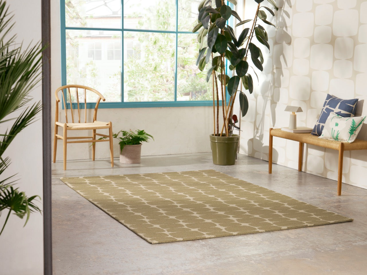
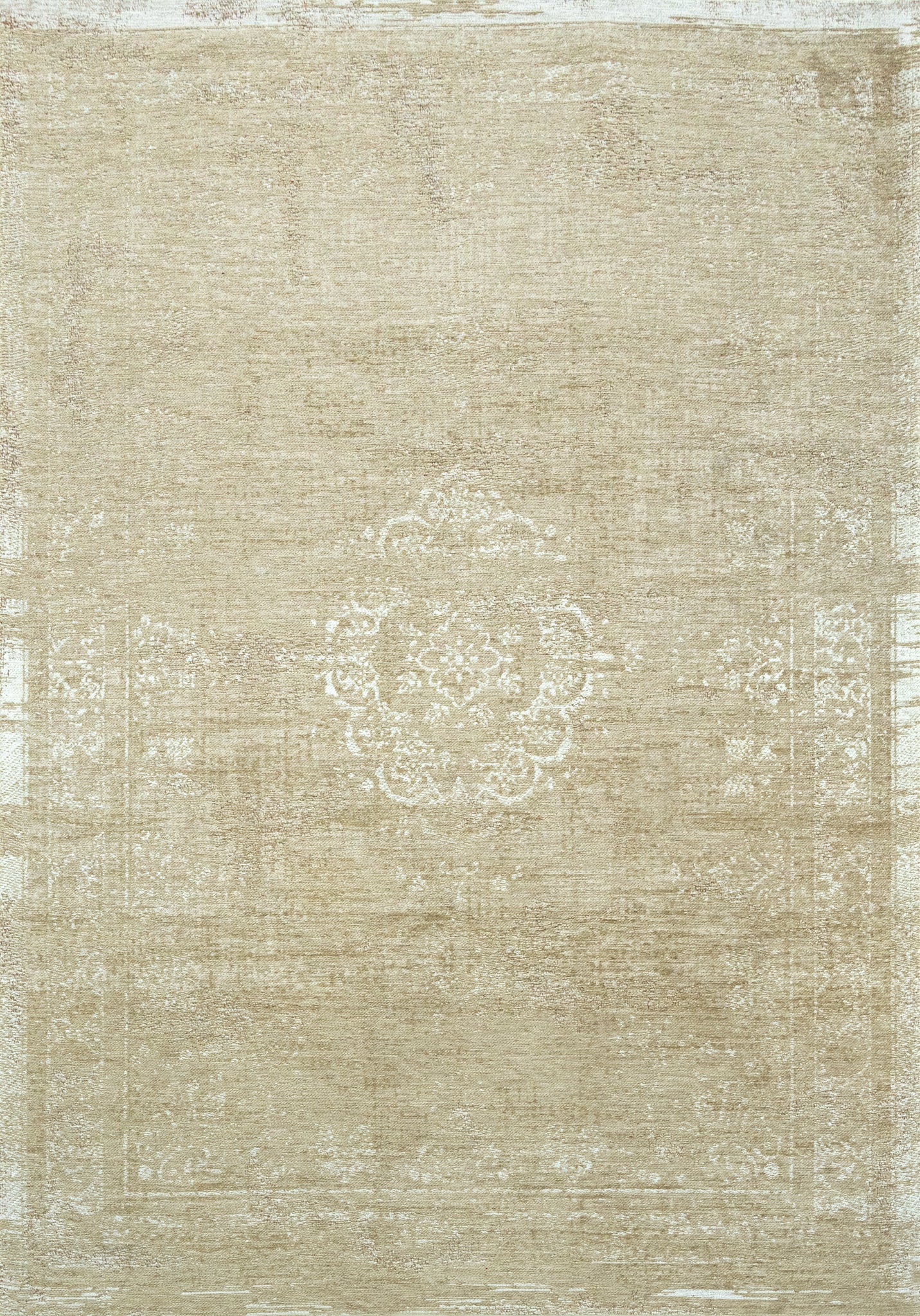
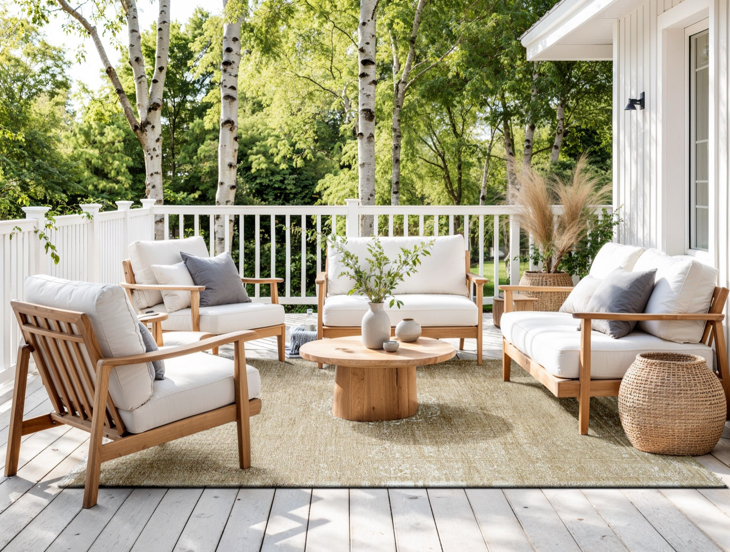


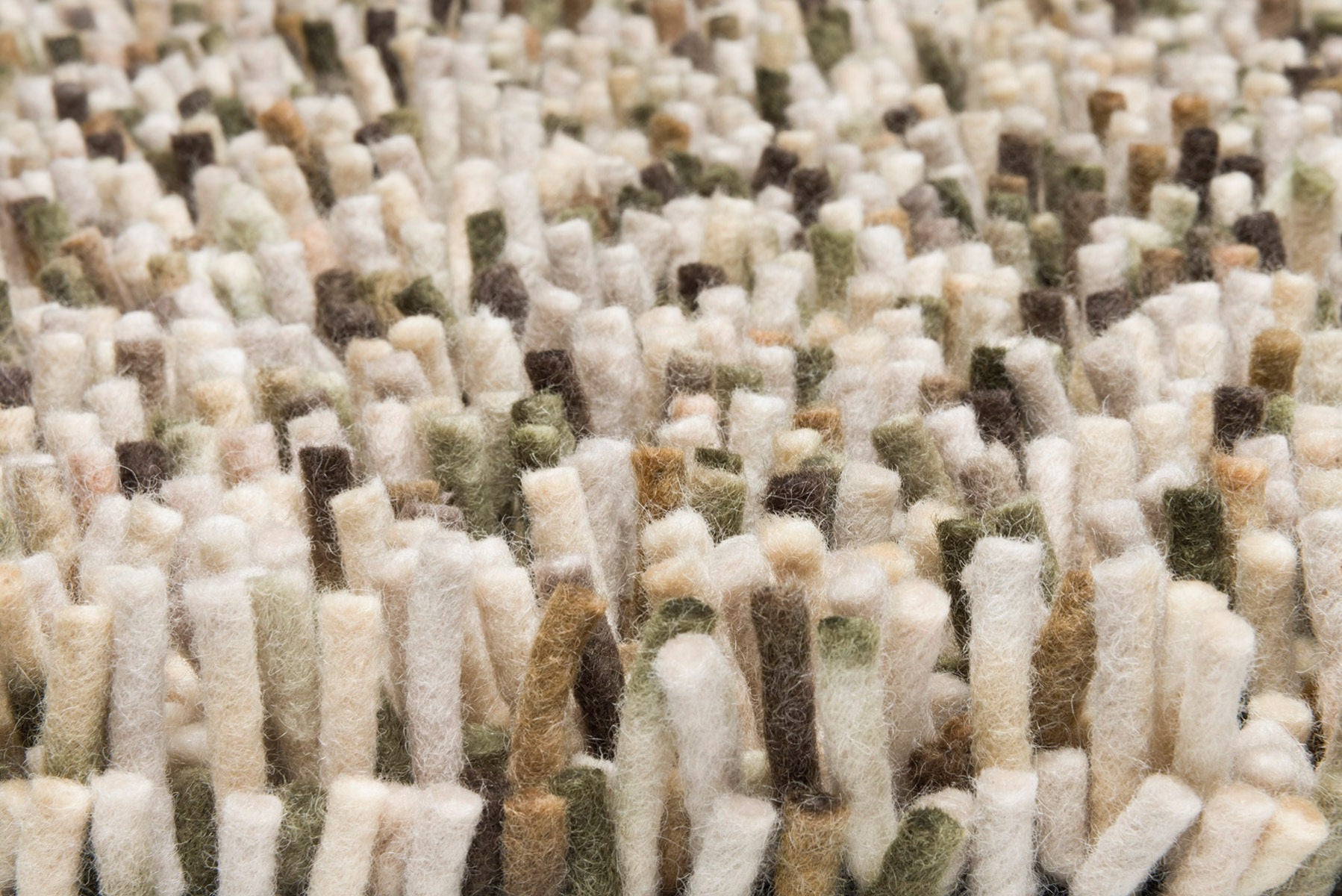

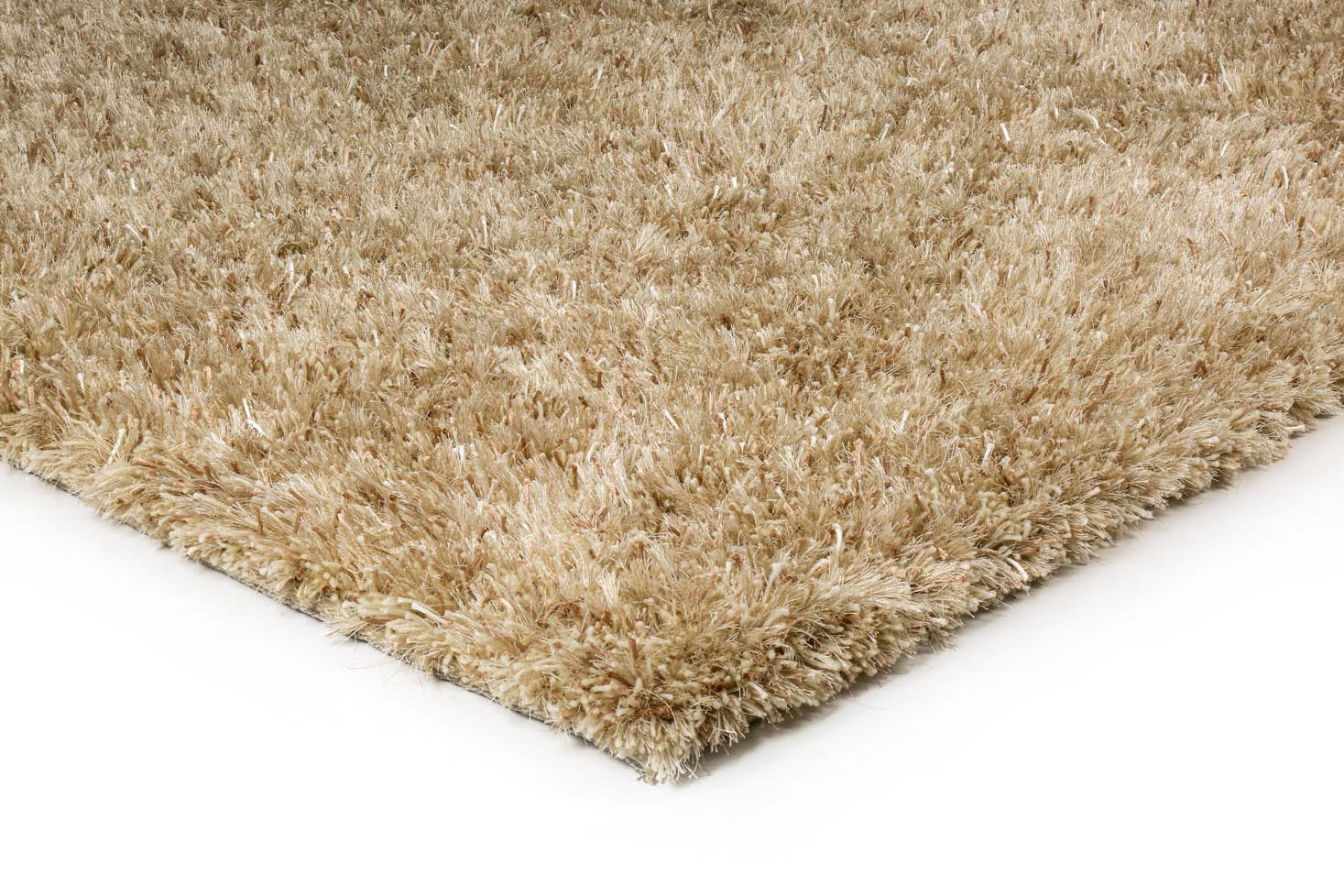
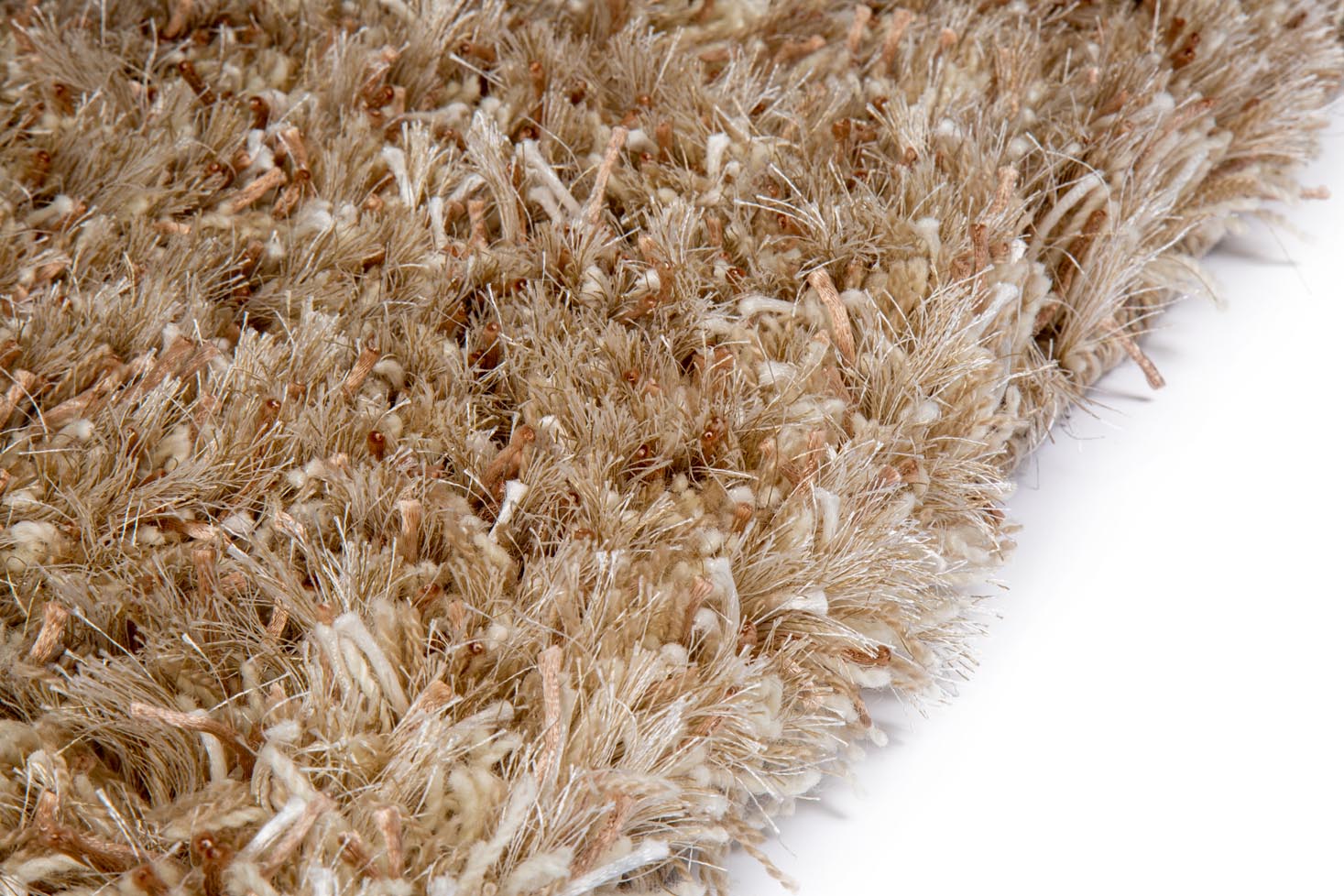

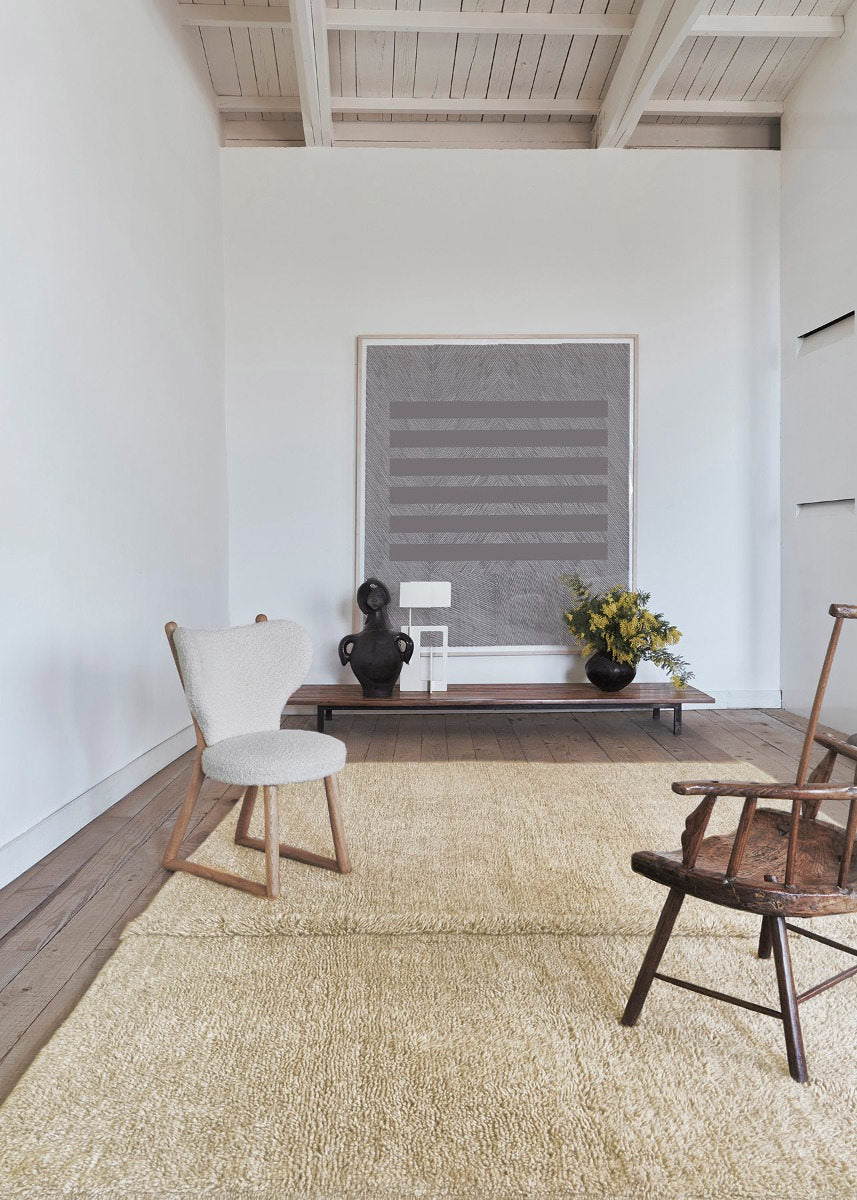
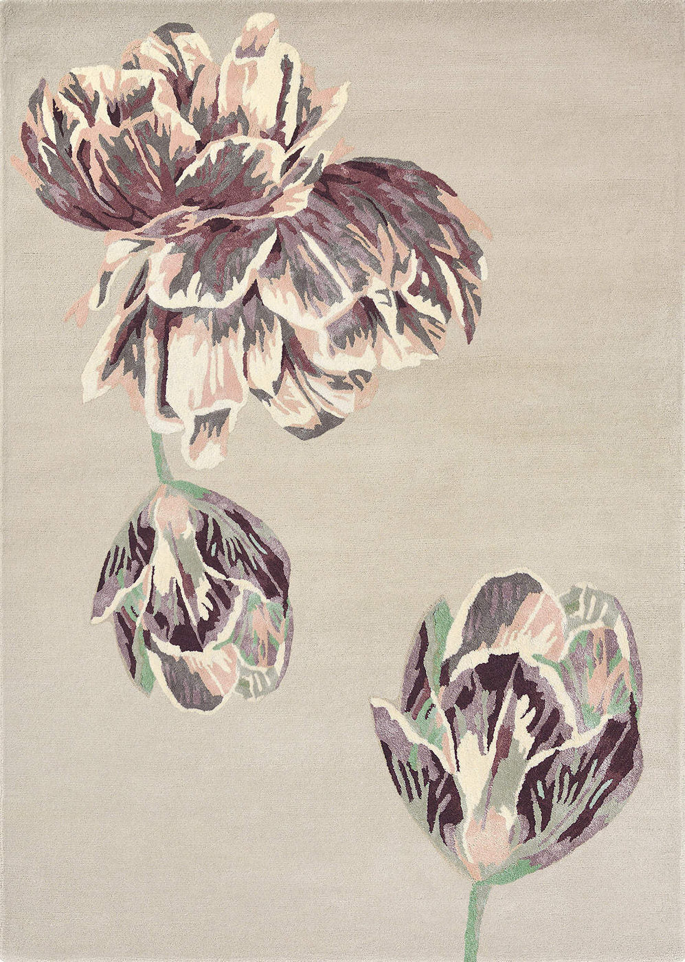
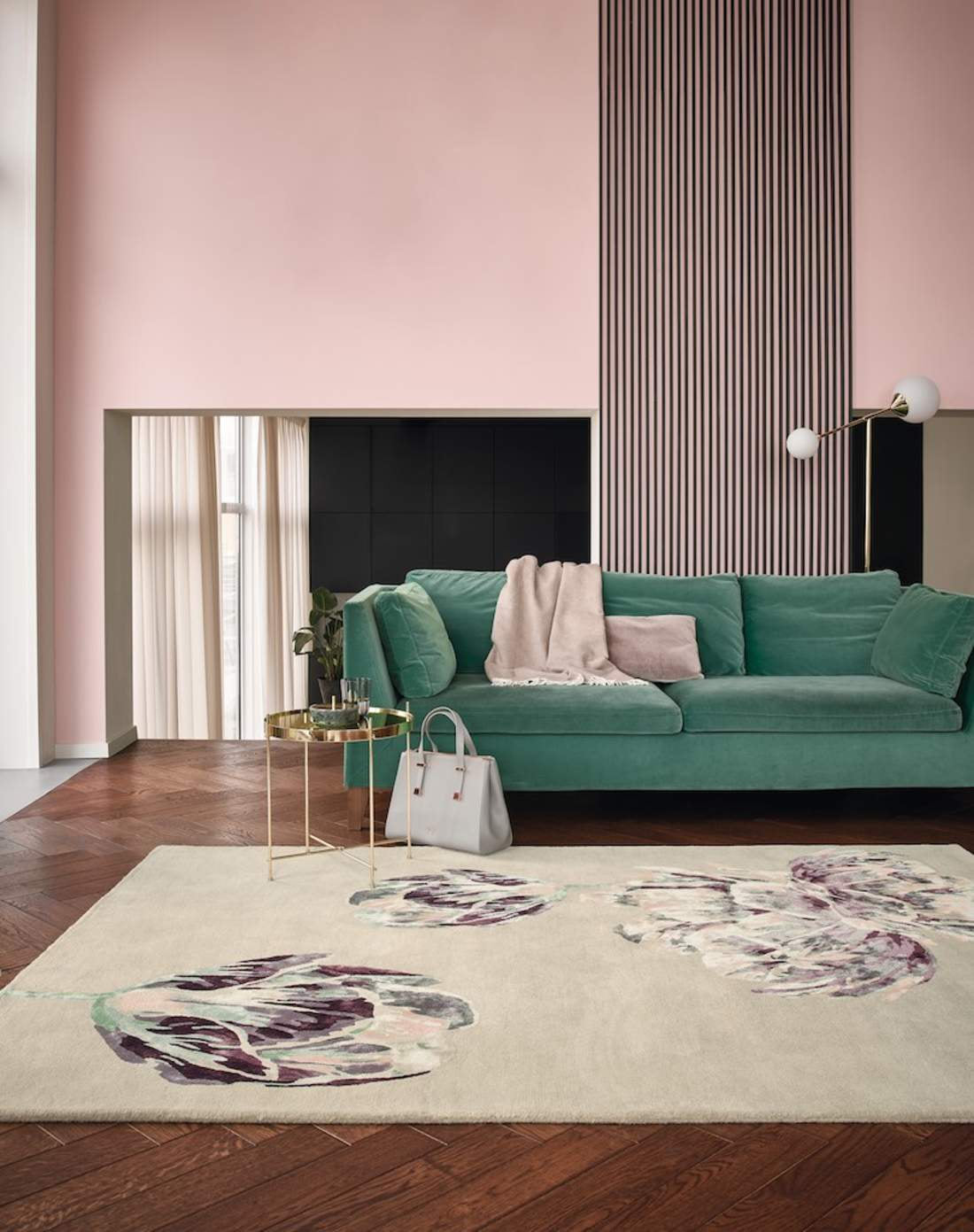
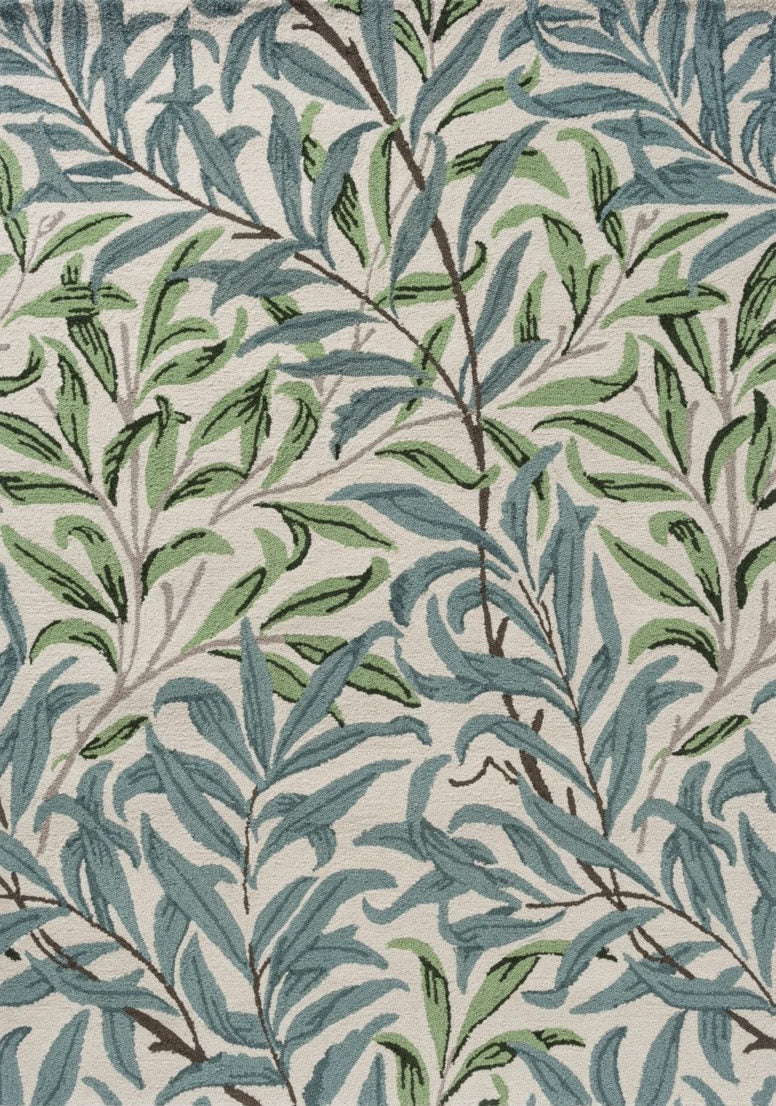
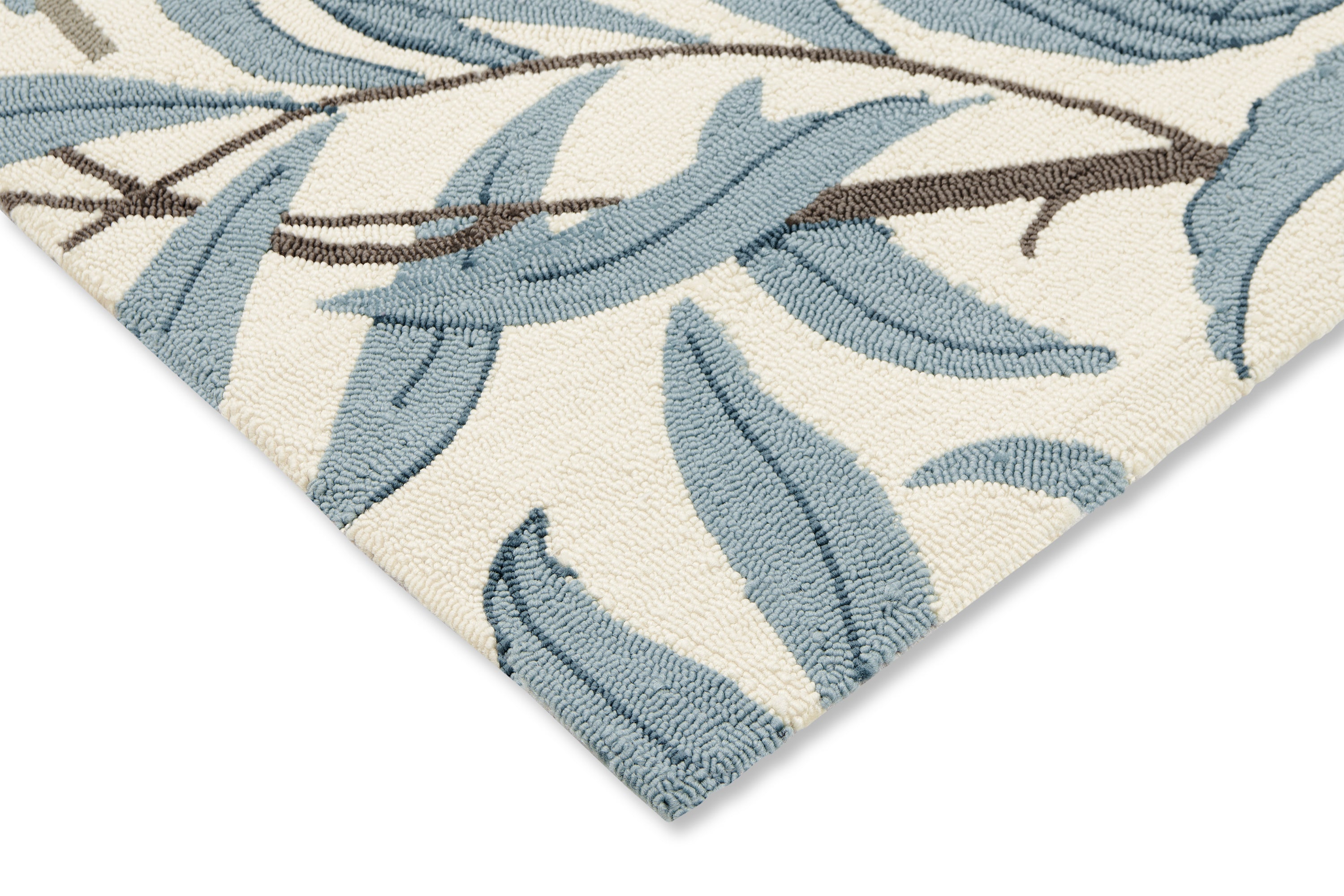
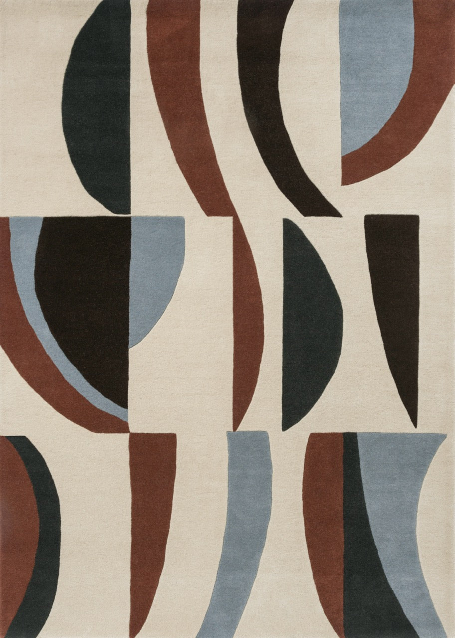
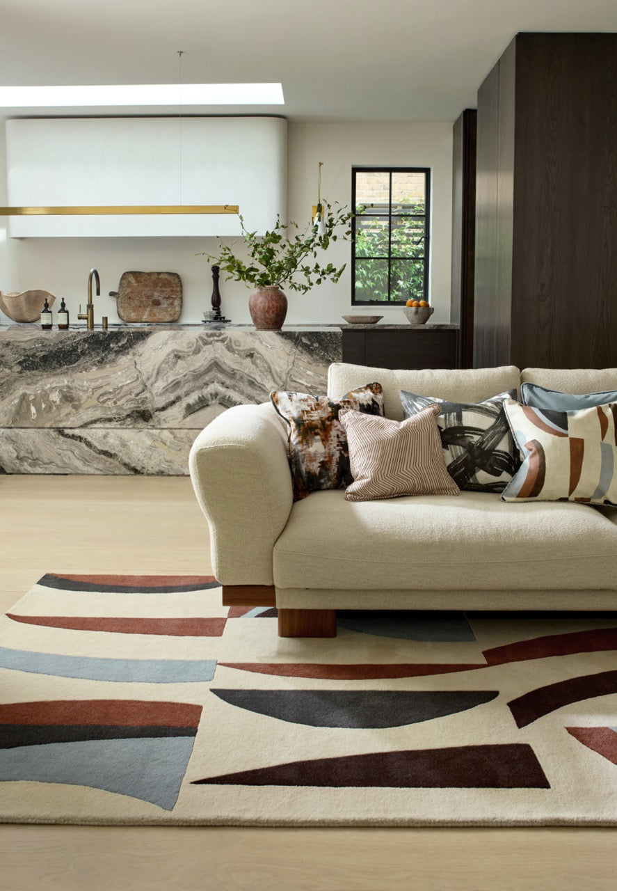



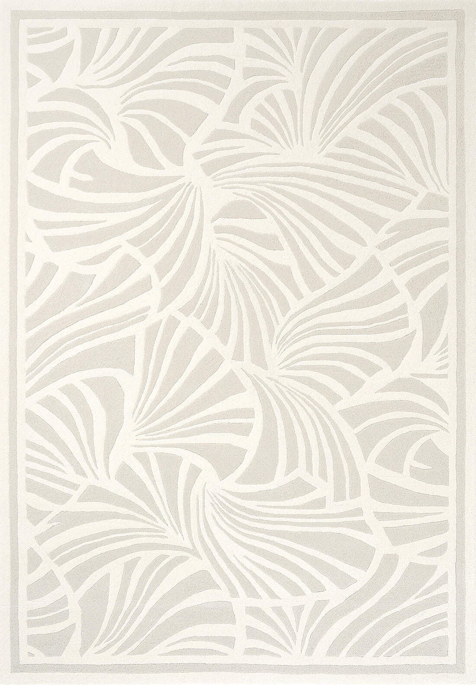
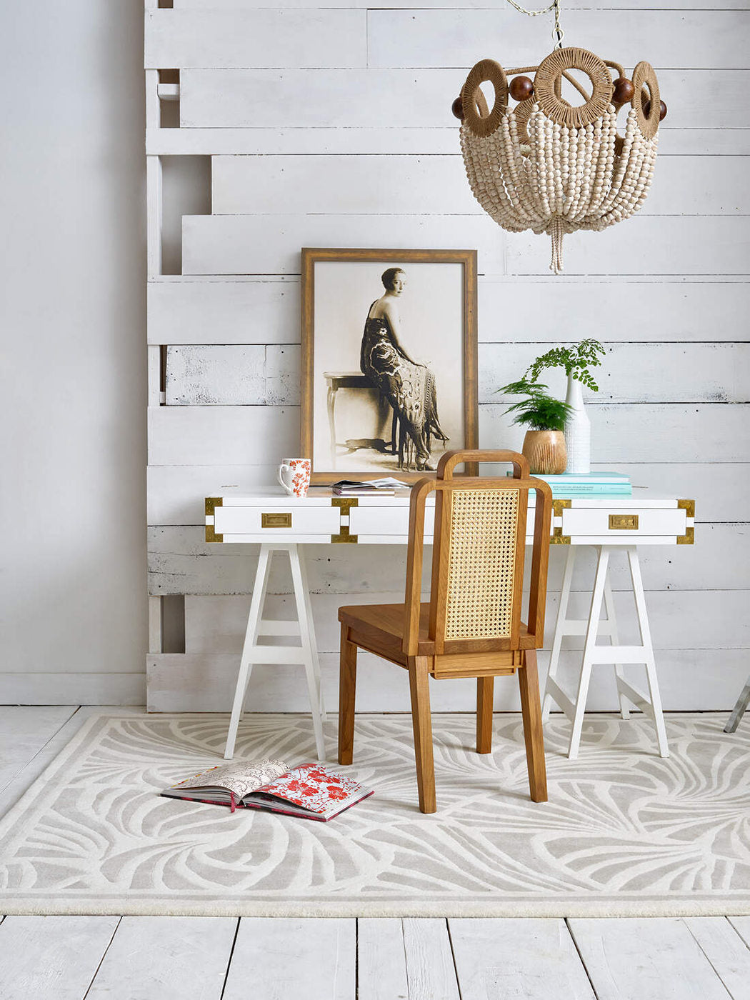
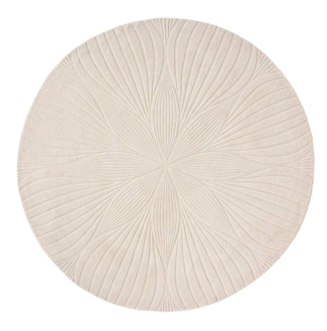

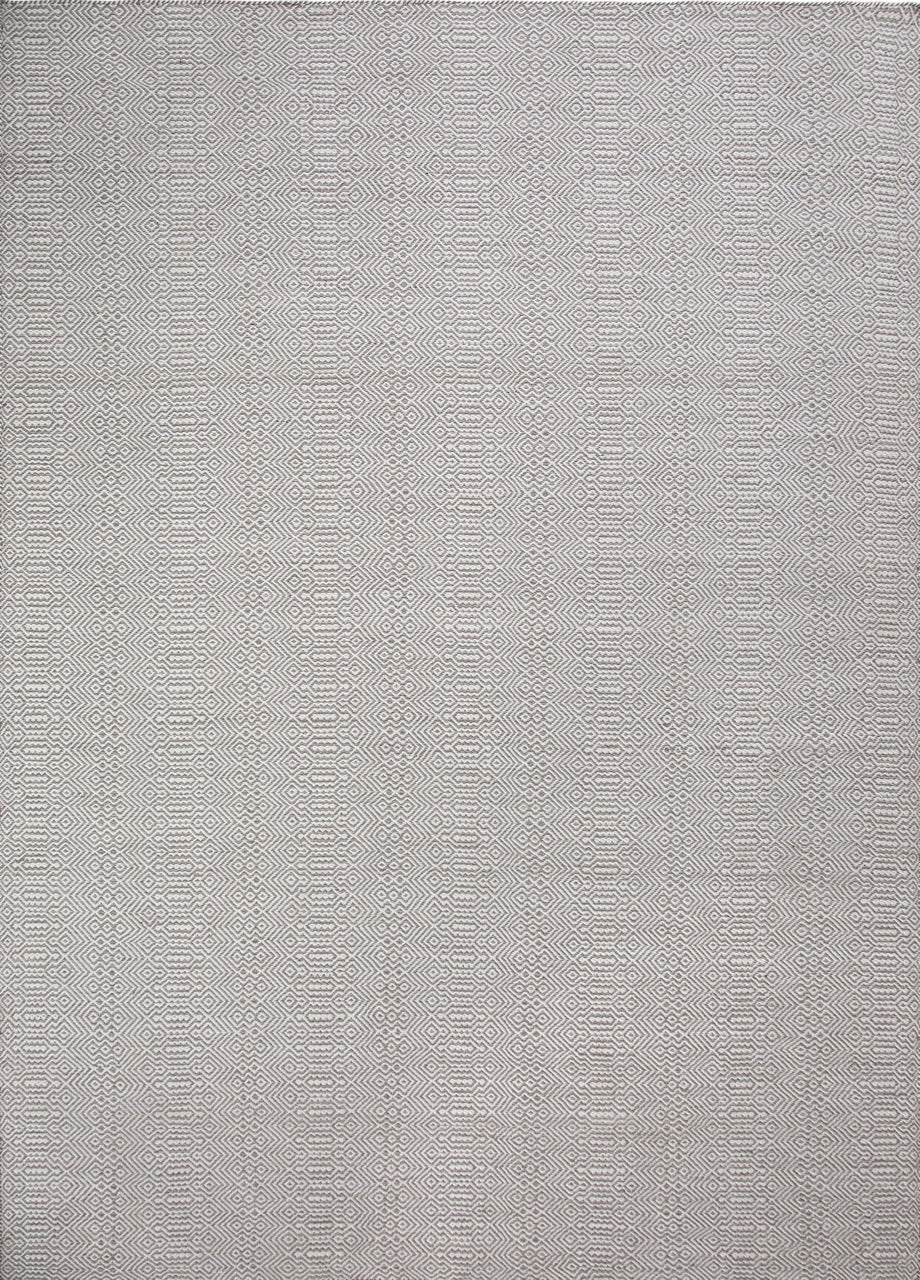
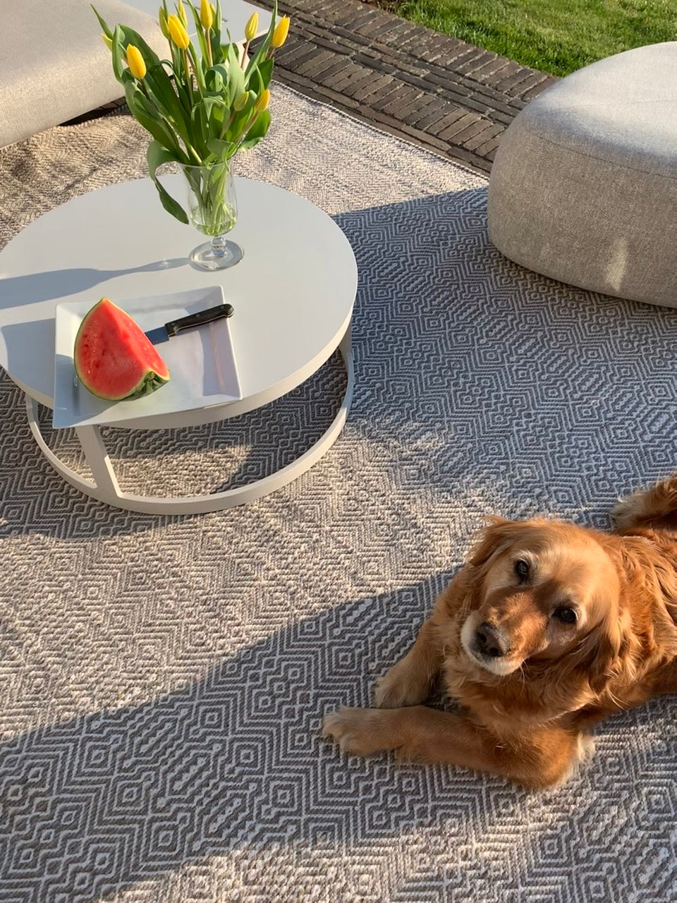
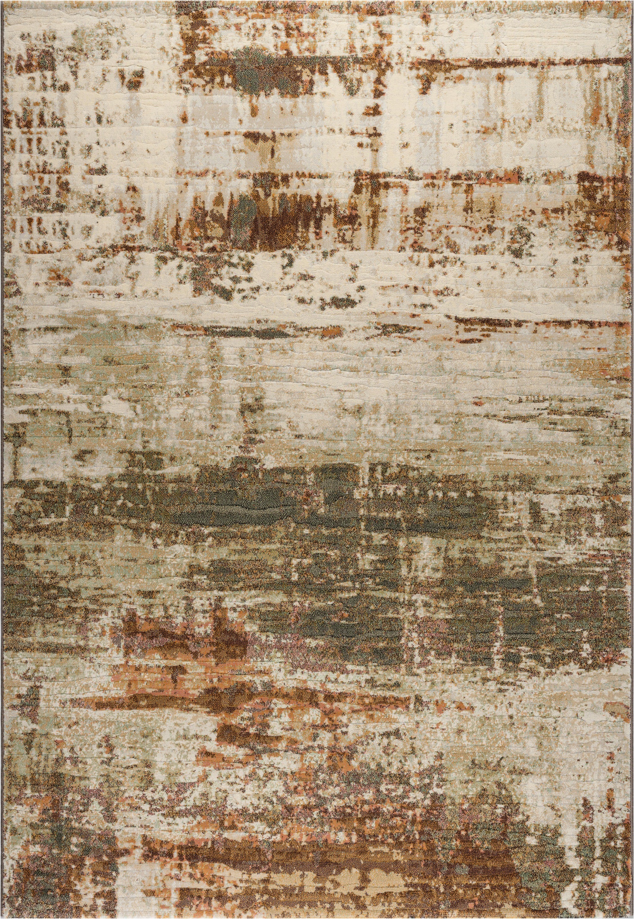
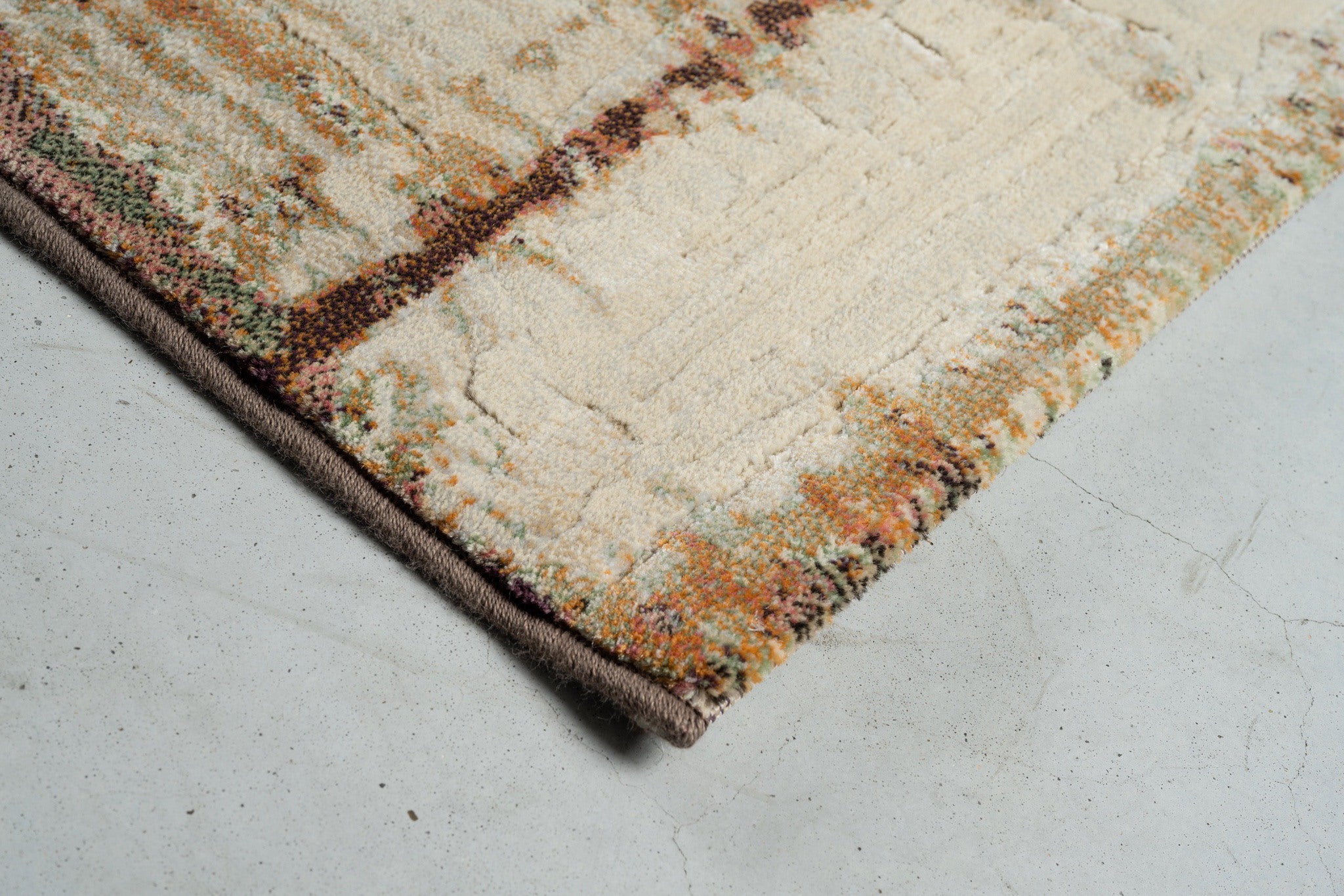


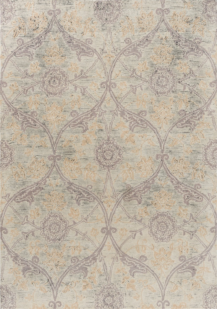
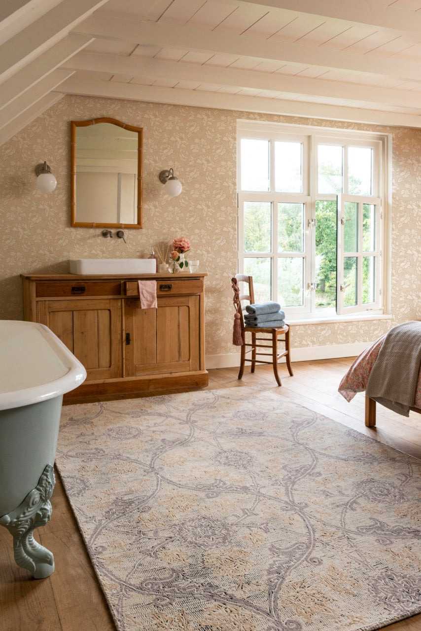
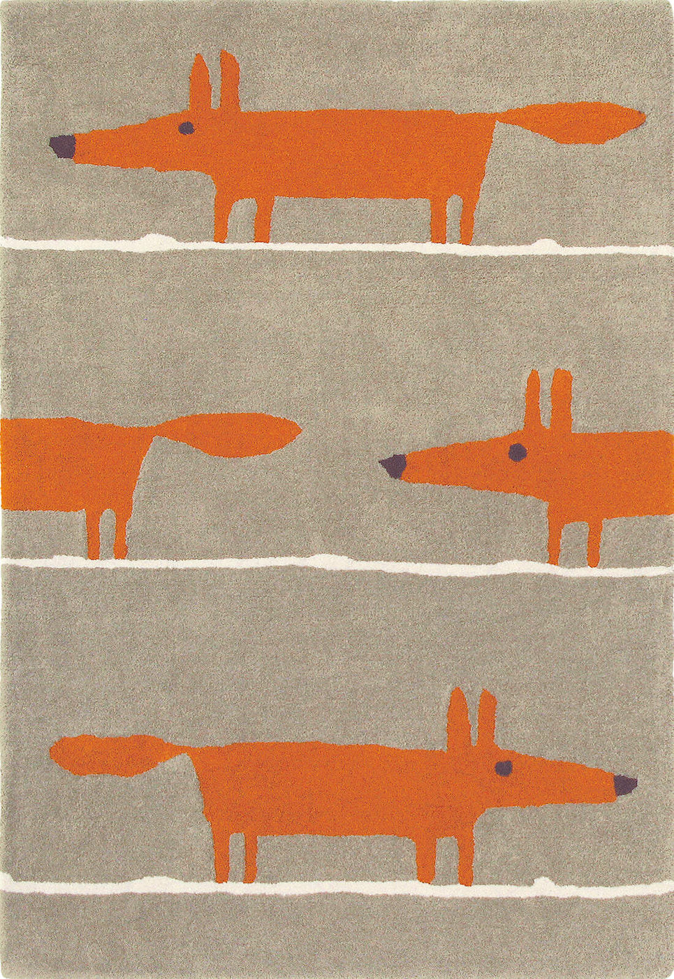
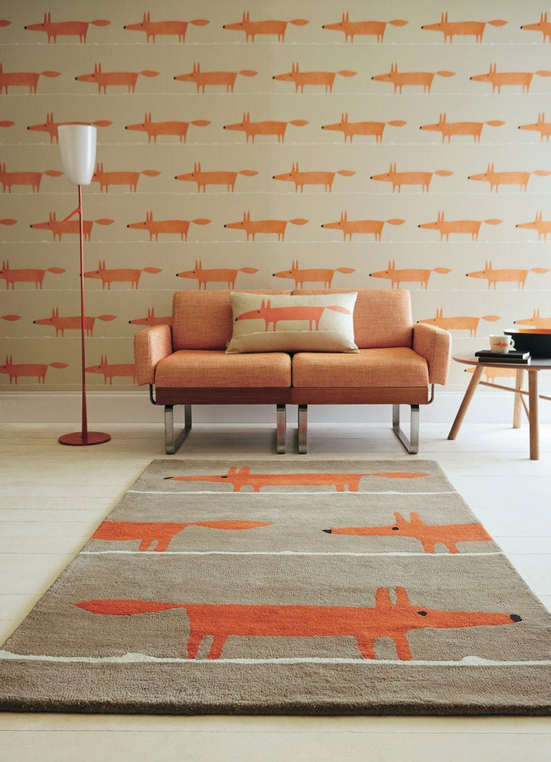


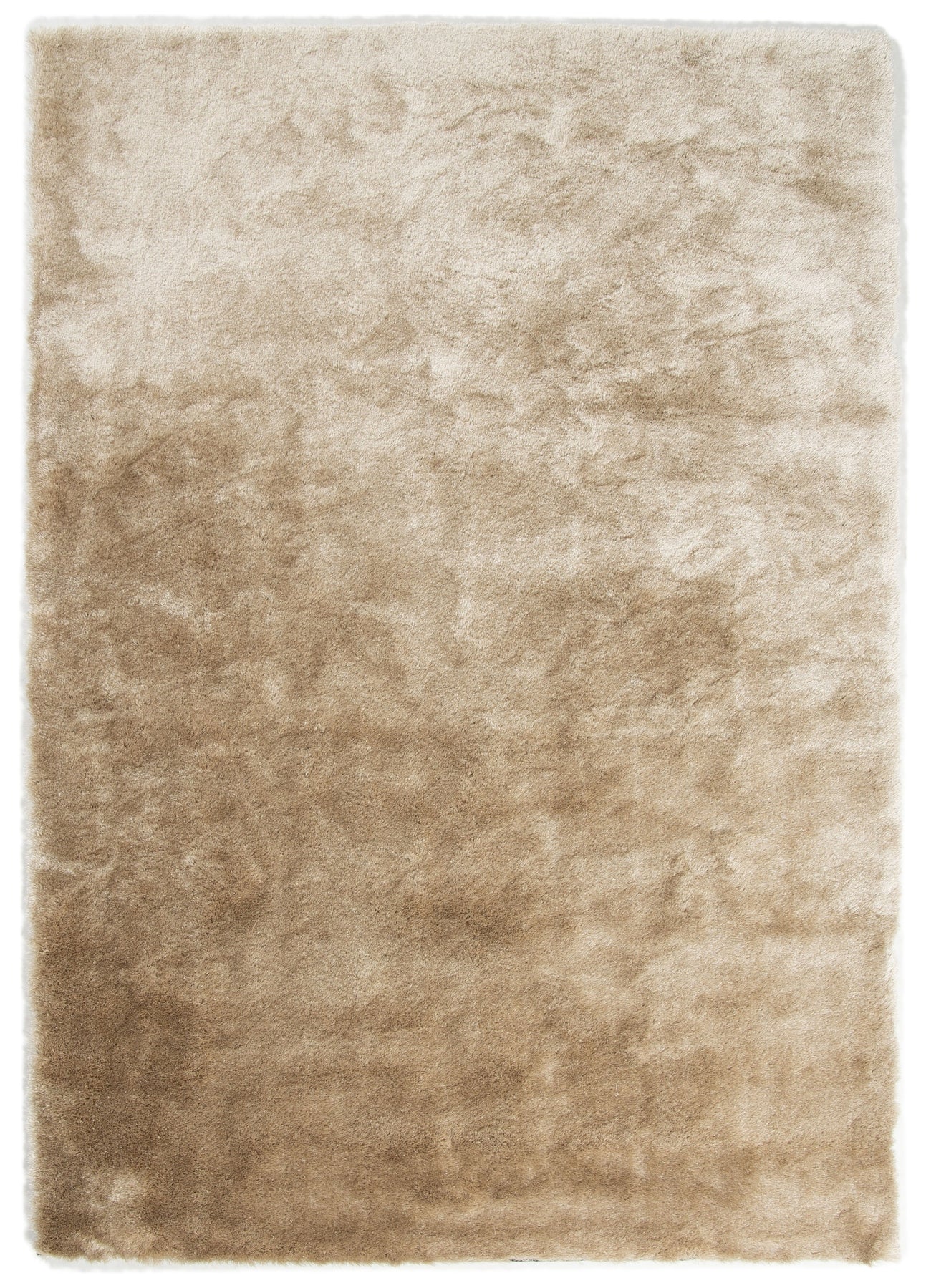
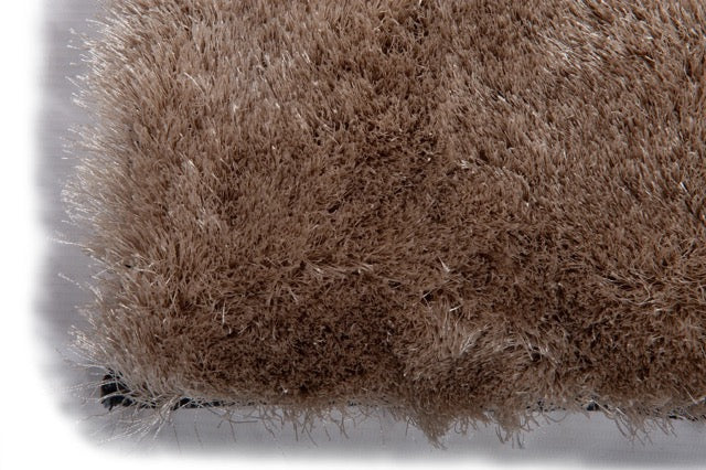
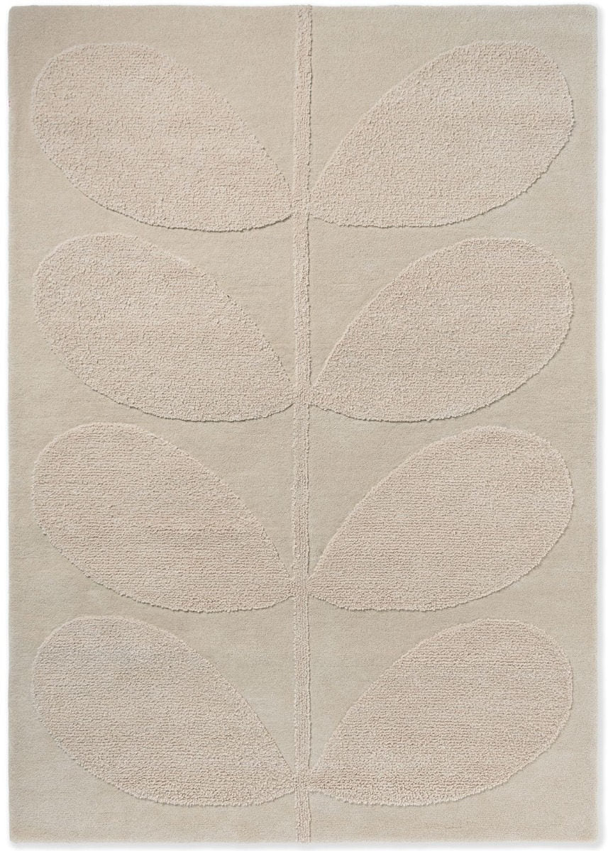
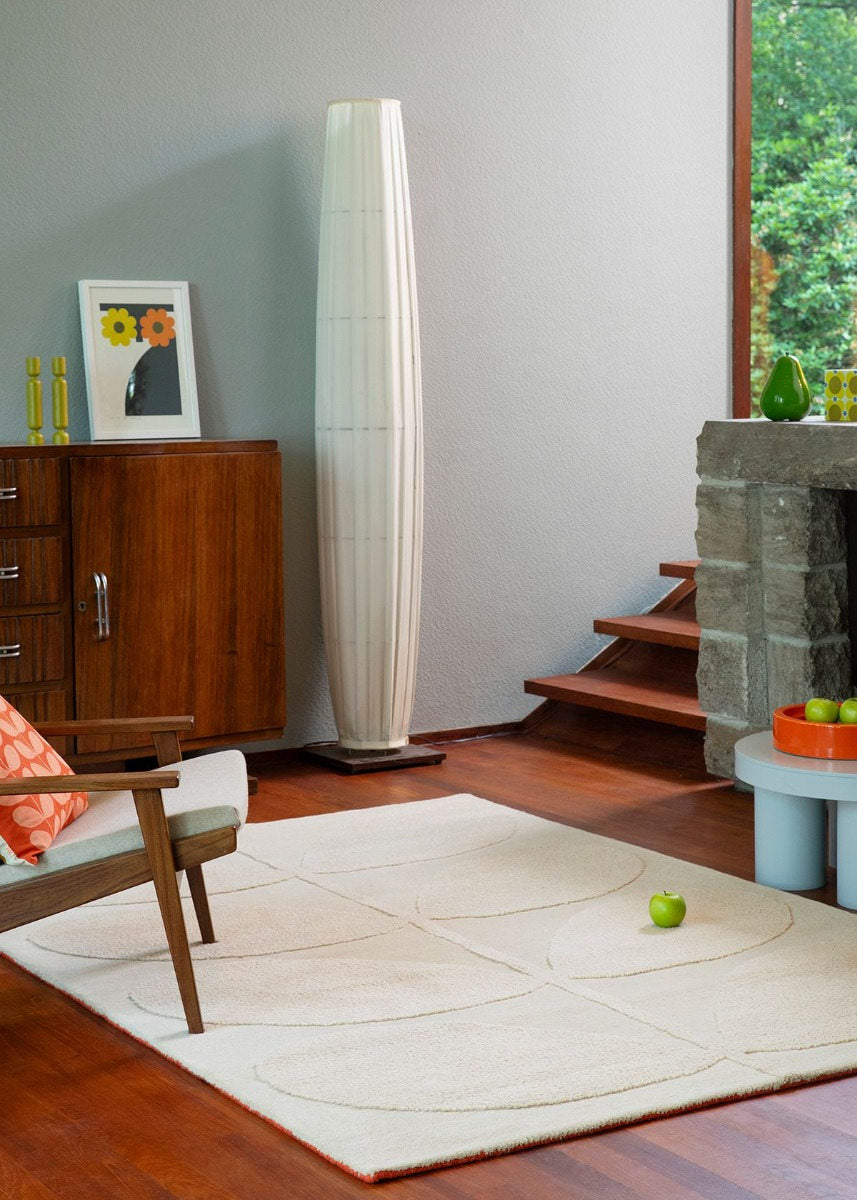


Warm undertones do something that cool neutrals cannot: they make a room feel inhabited rather than staged. A beige or cream rug introduces a sense of ease that looks effortless but is the result of careful material and tone selection. It is the colour category that pairs with almost everything, clashes with almost nothing, and ages better than nearly any other choice you can make for your floor. Where grey neutrals feel contemporary and considered, beige and cream neutrals feel settled and human. Both are valid; they are simply after different results.
The Cream and Sand Family
Beige is a broader category than it first appears. Within it sit cream, sand, oatmeal, stone, taupe and ivory, each with a different character depending on undertone. Cream sits closest to white, with a luminous softness that works particularly well in north-facing rooms where you want to draw in light without the harshness of bright white. Sand and oatmeal lean golden and feel warm even in low-light conditions. Stone has a cooler, more architectural quality, suited to rooms that already carry warmth and need visual clarity. Ivory catches light in a way that makes textured and hand-knotted constructions appear even more refined.
Understanding which member of the beige family suits your space matters more than most people realise. The wrong undertone, such as a pinkish cream placed against cool grey walls, can make the rug appear dingy or dated. The right one disappears in the best possible way: you stop noticing the rug and start noticing how good the room feels.
British Heritage in Natural Tones
Some of the most refined beige and cream colourways in this collection come from British design houses that have spent decades working with natural palette references. Sanderson's stone and linen tones are drawn from the English landscape and work particularly well in period properties and country houses where the palette references its surroundings. Morris & Co's botanical patterns read with particular clarity on natural grounds, where organic motifs sit against a softly bleached field that carries the feel of aged linen. Laura Ashley, Wedgwood and Orla Kiely each offer heritage interpretations of cream and stone that suit traditional interiors without the stiffness that older design associations sometimes carry.
The Layered collection from Sweden approaches beige from a stripped-back Scandinavian direction, quieter and more technically precise, sitting naturally in contemporary interiors where the reference is Nordic rather than English. Brink & Campman wool constructions in sand and dusty ground colourways offer exceptional fibre quality with long-term durability, making them one of the most considered choices for living rooms and dining rooms where the rug will see daily use. What these brands share is an understanding of beige and cream as active design tools rather than neutral defaults.
Texture as the Visual Language
When colour is quiet, texture carries the room. A flatweave beige rug reads as crisp and modern, well-suited to living rooms with contemporary furniture where the aesthetic leans towards simplicity and clean lines. A high-pile wool rug in cream adds physical warmth and visual softness, which makes it one of the instinctive choices for bedrooms where comfort rather than statement is the primary brief.
Hand-knotted and hand-woven constructions in natural fibres introduce subtle tonal variation across the surface, a quality that prevents a beige rug from reading as flat. The pile shifts as light moves across it, creating depth through shadow rather than colour. Vintage-inspired rugs with distressed finishes work on a similar principle: the slightly worn, faded quality of a well-executed vintage piece in cream or sand gives a room a collected feel rather than a purchased one. This is the territory of distressed flatweaves with heritage colour references, of any rug that looks as though it arrived in the room rather than was chosen for it.
Practical Notes
Mid-tone beiges and sands are more practical than their light appearance suggests. They sit in the range where minor marks and ambient dust are less visible than on very light or very dark surfaces. Wool rugs in this colour family are naturally stain-resistant and respond well to prompt blotting. Flatweaves are easier to maintain in high-traffic rooms and suit dining areas well, where chairs moving