
Collection: Grey Rugs
Versatile, timeless, endlessly adaptable





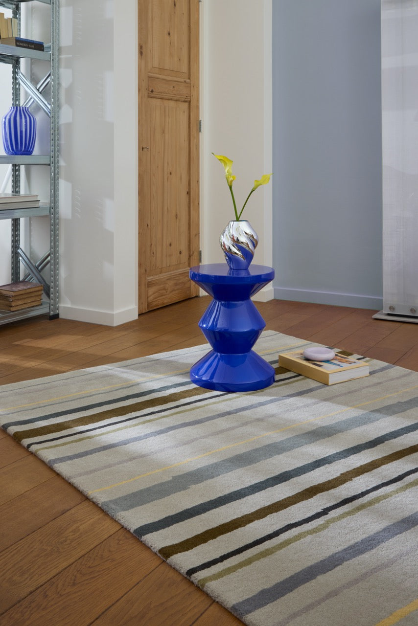


Grey Rugs: The Colour That Adapts
Grey is the ultimate neutral. It doesn't compete, it doesn't date, and it works with almost anything you put near it. A grey rug creates a foundation that accommodates bold furniture, subtle accents, or anything in between. It's the colour that makes everything else easier.
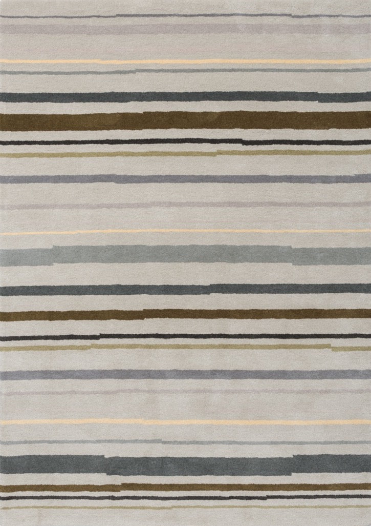
Our grey rug collection spans the full spectrum. Pale silvers that feel almost white, mid-tone greys that balance light and depth, and deep charcoals that add weight and sophistication. Each rug has been chosen because it understands that grey, when done well, provides versatility without feeling bland.
The Spectrum of Grey
Light greys, soft silvers and pale charcoals, make rooms feel more spacious and airy. They work particularly well in smaller spaces or rooms with limited natural light, where you want to maximise brightness without sacrificing warmth. These tones feel fresh and modern.
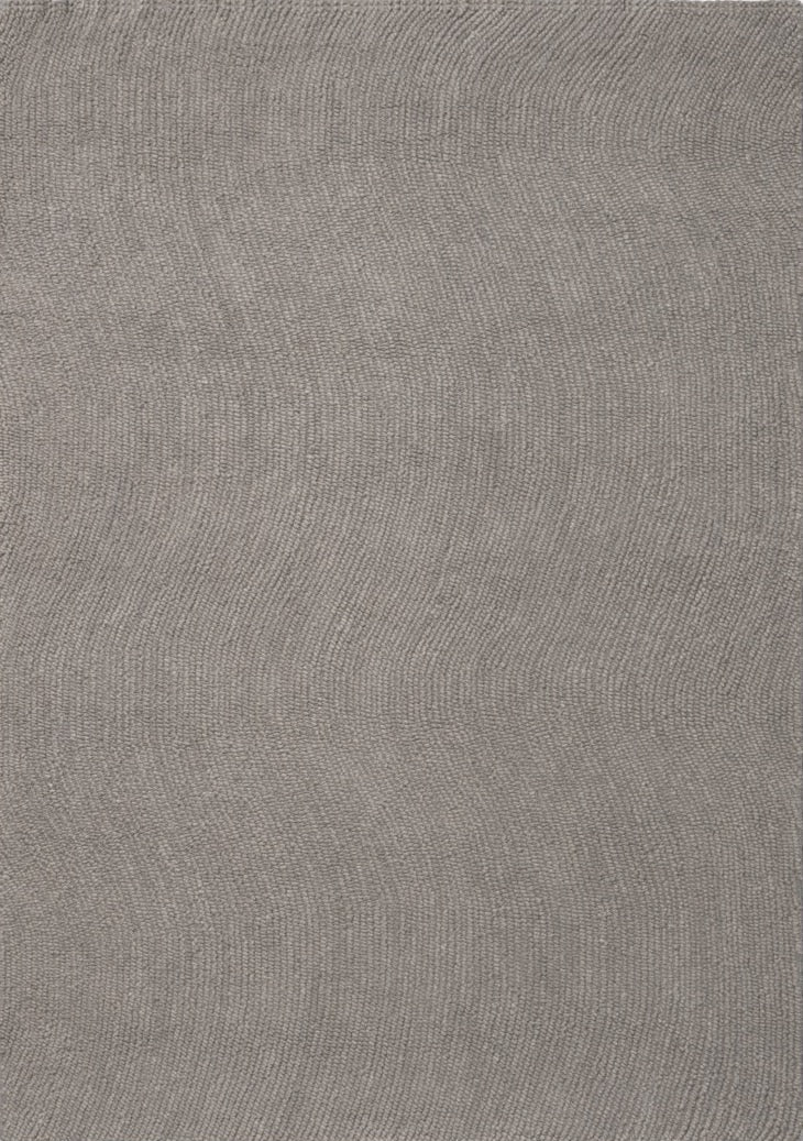
Mid-tone greys offer the most versatility. They're light enough to keep a room feeling open but dark enough to conceal minor wear and stains. A mid-grey rug works in almost any room, regardless of size, light, or existing palette. It's the safe choice that doesn't feel safe.
Dark greys, deep charcoals and near-blacks, add weight and sophistication. They ground a space and create a sense of intimacy, particularly effective in larger rooms where you want to make the area feel more defined and cosy. However, they show dust more readily, so they require more frequent maintenance.
Where Grey Rugs Work
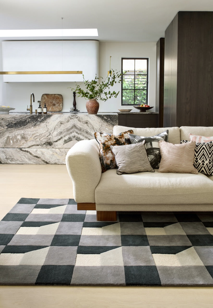
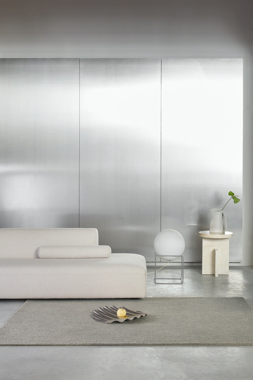
Living rooms benefit from grey rugs that anchor seating areas without dominating them. A grey rug beneath a sofa and coffee table creates definition, particularly useful in open-plan layouts where you need visual boundaries without walls. Pair it with warm woods and brass for cosiness, or with white and chrome for a clean, modern aesthetic.
Bedrooms suit softer greys that add warmth without disrupting rest. A grey rug beneath or beside a bed creates a sense of calm and balance, particularly effective in rooms with white or light-coloured walls where you want contrast without harshness.
Dining rooms can handle darker greys that bring formality and practicality. A charcoal rug beneath a dining table conceals spills and stains while adding sophistication. Pair it with warm wood furniture or brass lighting to prevent the room from feeling too cool.
Hallways and entryways work well with mid-tone grey runners. The colour hides dirt while still feeling welcoming, and it creates a neutral backdrop that doesn't clash with whatever colours exist in adjacent rooms.
Studies and home offices suit grey rugs that create focus without distraction. A mid-tone grey in a flatweave or low-pile construction feels professional and uncluttered, ideal for spaces where you need to concentrate.
Styling Grey Rugs
Grey works with almost any palette. Pair it with warm tones like beige, terracotta, or mustard for a cosy, inviting feel. Combine it with cool tones like navy, forest green, or white for a crisp, modern aesthetic. Layer it with metallics like brass, gold, or chrome to add richness and sophistication.
The key is understanding undertones. Some greys lean warm, with slight brown or taupe undertones. Others lean cool, with blue or green undertones. Warm greys suit rooms with warm wood and brass. Cool greys suit rooms with chrome, white, and modern furniture. The wrong grey in the wrong context can feel cold or dingy, so consider your room's existing palette before choosing.
Grey rugs also work well in layered interiors. A grey rug over a larger jute or sisal base creates dimension and defines zones within open-plan spaces. Pairing a grey rug with textured cushions, throws, or curtains in complementary tones adds depth without introducing too much colour.
Material and Texture in Grey Rugs
Wool is the most practical material for grey rugs. It's naturally stain-resistant, durable, and soft underfoot. A wool grey rug works in high-traffic living rooms, dining rooms, and hallways where the rug needs to withstand daily use.
Viscose brings a silk-like sheen that makes grey appear richer and more dimensional. The sheen catches light, adding depth and visual interest. However, viscose is less durable than wool, so it's best suited to low-traffic areas like bedrooms or studies where aesthetics are the priority.
Cotton and flatweave constructions offer a more relaxed, casual feel. They're easy to clean and suit Scandinavian or coastal-inspired interiors where the aesthetic leans towards simplicity. Flatweaves also sit lower to the floor, which can make a room feel more open.
High-pile and textured grey rugs add warmth and tactility, perfect for creating a cosy atmosphere in minimalist living rooms or bedrooms. Texture becomes the focal point when colour is neutral, so a high-pile grey rug can add visual interest without introducing pattern.
Practical Considerations
Mid-tone grey rugs are the most forgiving when it comes to stains and wear. They don't show every footprint like lighter rugs, and they don't show dust like darker rugs. This makes them practical for high-traffic areas or homes with children and pets.
Maintain colour vibrancy with weekly hoovering. Treat spills by blotting rather than rubbing. Wool grey rugs benefit from annual professional cleaning to preserve the integrity of the fibres and keep the colour looking fresh.
Rug pads prevent slipping and protect flooring, particularly important on hard surfaces where grey rugs might shift underfoot. They also add cushioning, which enhances comfort.
Choosing Your Grey Rug
Consider your room's light and size. Light greys suit smaller or darker rooms. Mid-tone greys work almost anywhere. Dark greys add sophistication to larger, well-lit spaces.
Think about your existing palette and the mood you want to create. Warm greys enhance cosiness. Cool greys create crispness. The undertone affects how the rug reads in a space, so match it to your room's existing tones.
Choose material based on your lifestyle. High-traffic areas need durable wool or flatweave. Low-traffic spaces can accommodate more luxurious options like viscose or high-pile constructions.
Grey is the colour that doesn't demand attention but does enormous work behind the scenes. It's the foundation that lets everything else in a room function. Find the shade that works for your space and watch how it makes everything else fall into place.